An identity built to disappear.
Hermès Résidence carries the codes of the Maison and holds them to a whisper. Typography, materials and layout form a frame calm enough to vanish behind the work it welcomes. An identity conceived as open ground, waiting for the hands that will fill it.


Crossing to the other side of the brief.
Each year, Hermès sets a theme. For this first edition, l'appel du large. Once the brand foundations were set, I stepped into the residency as its first invited creative: art direction gave way to the camera, and the rules I had written turned into a playground.


Four fragrances, four worlds.
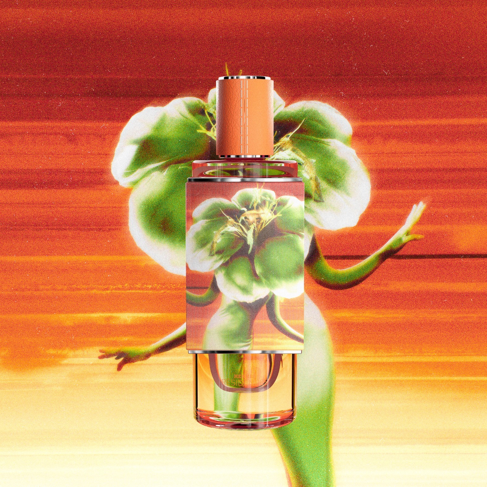
La main, l'écart, l'étonnement, le jeu. Four imposed themes, each paired with a single dominant palette, the only elements held constant across the collection. Everything beyond them belongs to the artist, who writes the name of the fragrance in their own hand and redraws the Résidence logotype as a signature. A shared grammar, four distinct languages.


The world fills the frame.
From campaign visuals to product sheets, the image extends far beyond the object. Colour, texture and set run edge to edge, carrying the universe of each fragrance into the most technical pages. Total immersion, down to the last detail sheet.


The beauty of the making.
An annual edition documents each collection from the inside: research, gestures, materials, trials, savoir-faire. The finished object tells one part of the story. The edition holds the rest and gives the process the same status as the result.